e-Learning Ecologies MOOC’s Updates
Pop Art: Visuals in Multi-Model Learning
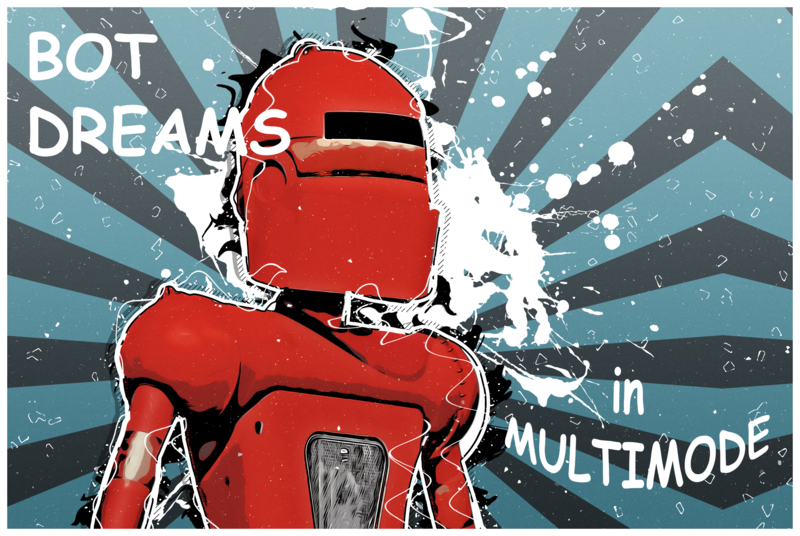
As an artist, I've always loved working in multi-modes: visual, tactile, audio, text. I created the image above from a photo I took of the robot outside Meow Wolf in Santa Fe, New Mexico. He/She seems to capture the idea of multi-modal learning. I manipulated the image using Adobe Photoshop using a set of "toon tools" so I could post something with my discussion contribution. I tried to add some audio to emphasize even further the multi-modal effect of the work (cue robotic futuristic sound bit), but that might have to wait for another post.....but this is my attempt to demonstrate a concept of multi-modal in practice: combining a rich image with text. The kind of font you use to illustrate your work is just as important as the image. For example, what if I had chosen some other text than COMIC SANS? What if I had used OLD ENGLISH?? Would the message (contained in image and text) work??
Learning can happen via trial and error, and much of our life experiences can confirm this. However, learning by design, as influenced by theory/pedagogy can be a beautiful thing, an aesthetic experience even. So even though I teach in a health profession, the influences of the visual, tactile, auditory, and yes, aesthetics, influence my conceptualization of the idealized "classroom".
But as an educator, I've had to upskill significantly: learning to 3-D design and print, 3D-Scanning, virtual reality, delving into UI/UX (who knew a button press in an app has to "look right"?), learning the usefulness of apps like Kaltura, ADOBE creative cloud, learning about free content for image, text, and sound from Creative Commons....and now, bringing those still-budding skills together into the coursera on e-learning ecologies. To me, this is what the full blown experience of teaching ought to feel like: offering an adventure of learning. I know some of my colleagues look at me like I have ADHD....but there is purposefulness, I think, to my madness.
For this post, I'd like to delve a bit more into visual learning. Visual learning is influenced by color, image, size, shape, placement and juxtaposition of elements (University of Cincinnati). When we use these elements thoughtfully, we can influence the retention of learning. Visual learners can even"key" into the gesture or expression on the face of educators and make that an anchor in learning. This is probably why I have a preference for educators who lecture with an effortless flair and dynamicism.
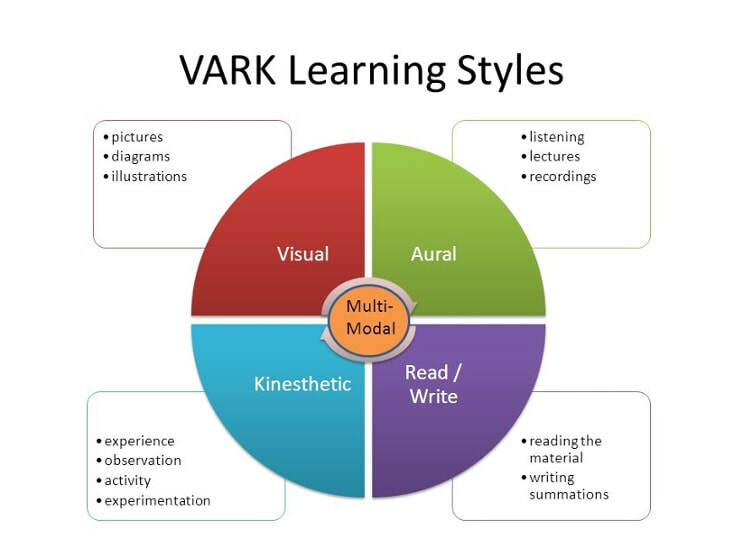
When creating a piece of learning content, I know I want to "VARK" it.
Marcy (2001), suggests even instructors should take the VARK questionnaire to discover their own learning preferences, as well as determining the learning preferences of students. I have strong visual learning preferences, and that tendency to rely on visual presentation has even become more pronounced in my teaching when I prepare "assertive-evidence" slide presentations (Alley, 2020).
Assertive evidence slide design is a strategy to create slides that "stick" to the mental flypaper of the learner. Instead of a title and bullet points, the slide designer makes an assertive statement in the title of the slide, and anchors the slide with a strong image or graphic. The "bullet" points go in the speaking notes: the auditory component of the presentation. The use of assertive evidence slide design is definitely becoming evidenced (Garner, Alley, Wolfe, Sawarynski, 2011): learners remember lectures better using assertive evidence slide design, than traditional powerpoints (yawn). But I digress.
The main point, is: visual images whether photos, graphics, or representations of data/graphs/pie charts are an important design element in creating multi-modal learning content. They are not merely illustrations or decorations, but are central to anchoring the learning experience and cognitive recall of learning. Visual elements can be just as important as what the instructor says with words. I would encourage my peers not to give short shrift to the selection of images (get the best quality image you can acquire, not just 72 dpi's created for web), but images of no less than 300 dpi for powerpoints or Prezis. Try going to Creative Commons Flikr Stream to find photos representing a concept you want to emphasize with students (art, biology, people, things). I frequently go to the Flikr streams of the U.S. government, because the photos for say, Department of Agriculture, are mostly in the public domain and can be used freely.
References:
University of Cincinatti. https://www.uc.edu/content/dam/uc/aess/docs/LACResources/Strategies%20for%20Visual%20Learners_6_25_2012.doc.pdf
Graphic of the vark: https://tutoringwithatwist.ca/vark-learning-styles/
Marcy, V. (2001). Adult Learning Styles: How the VARK© Learning Style Inventory Can Be Used to Improve Student Learning, Perspective on Physician Assistant Education, 12(2)
Alley, M. (n.d.) Assertion-evidence slide templates. Pennsylvania State University. Retrieved from: https://www.assertion-evidence.com/templates.html
Joanna K. Garner, Michael Alley, Keri Wolfe, and Lauren Sawarynski (2013). Using the assertion-evidence approach leads to better comprehension
and recall by the audience. International Journal of Engineering Education, 29 (6). Retrieved from: https://www.assertion-evidence.com/research-papers.html


